
Redesigning Your Website: A Few Nuggets of Advice
I’ve gotten some questions recently from friends and readers about starting a website or redesigning a current one. So I thought I’d put this post up (that I wrote for my agent Chip MacGregor’s blog a while ago), in case you missed it. Hopefully, by sharing my experience, it will help you in your own design or redesign process. And you can always feel free to leave a comment with questions, or email me too!
To give you an idea of where my site was when I began my redesign process with Aaron Robbins, I probably need to share a little about my website history. I began blogging in 2008, on a free Blogger blog at the URL www.mycup2yours.com. The platform served my purposes well (writing parenting posts geared toward moms) and I was happy with the functionality and design.
Over the next few years, as my blog began to grow and my passion for writing in the parenting genre became more serious, I changed the appearance of my site, added more selections to my navigation bar and more widgets in my sidebar. I’ll admit, at the time, I didn’t really have a long-term vision for my site. I was just sort of tweaking it as I went. I also bought the domain for my name and created my own website through WebSiteTonight for gennyheikka.com. While I wrote about parenting regularly on mycup2yours.com, this second URL was where I had my writing bio and information about the children’s books I had written.
Managing two sites turned out to be difficult and time consuming, so a little while later, I made a major change, switching from mycup2yours.com on Blogger to gennyheikka.com on WordPress, combining the two. So not only did I switch blogging platforms, years of blogging at mycup2yours transitioned to gennyheikka.com.
It was a hard decision and one that came with some complications in terms of SEO, redirects, and lost subscribers, but it was the right thing for me to do for branding purposes. I wanted one place that readers could find me and all my work, rather than going to one site for my blog and another to find out about my books, speaking, and other writing.
All of that to say, when I looked at redesigning my website recently, the site I had was a combination of what was pulled together as a result of that transition, and that had basically just compiled over the years. I wasn’t sure what to keep, what to toss, or what look I even wanted. The only thing I knew for sure is that I wanted my new design to be clean, simple and welcoming.
I love how it turned out.
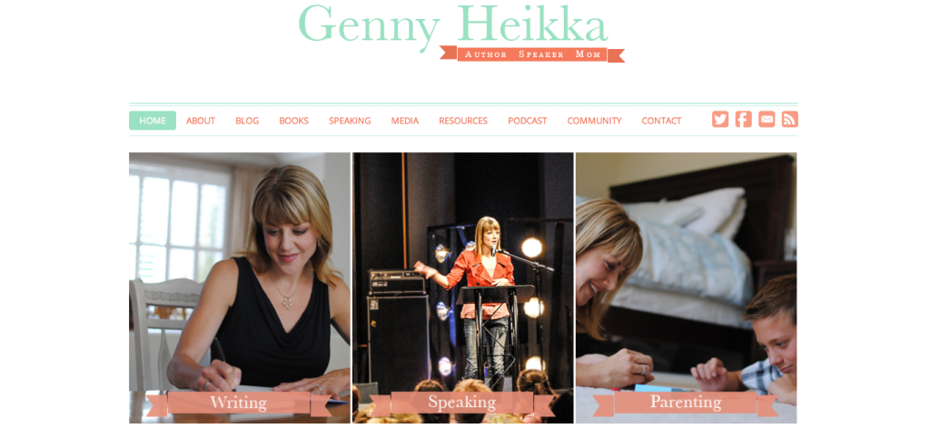
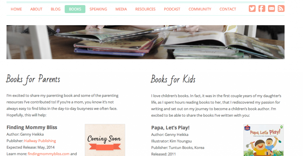
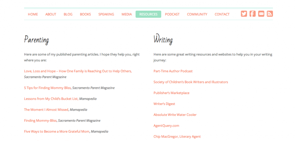
Honestly, I have Aaron to thank for how it looks and functions. I love the forms he put on my Speaking Page, the video, audio, and photos he suggested for my Media Page, and the different ways people can connect with me.
While I went into the process focused on what my site would look like, he asked questions that helped me dig deeper into why I write, how I’m impacting those who read my work, and how to best tell that story (all things that would impact my design, though I didn’t realize it yet.)
Some of his questions he asked me–that I’d encourage you to think about if you are considering a new author or writer website–were:
Why do you write?
How would the world change if your point of view wasn’t available?
Who are the people already reading you?
Why are they reading you?
What needs does your writing fulfill in others?
What do you have of value that you can give away regularly?
I never knew there was so much behind website design, but I learned that going through a detailed process of answering these types of questions and making sure your site aligns with your answers makes your digital content much more clear, compelling and useful.
While I give the credit for my site design to Aaron, I do have a few nuggets of advice that I learned from my experience. If you are looking at redesign your existing site, here are some tips:
1. Ask questions before thinking about appearance (what do you do, and why do you do it?). Your answers will impact your site’s look, feel, and functionality.
2. Take time. A well-thought out website doesn’t happen overnight. My website redesign took about four months and it was definitely worth the process.
3. Look at other people’s websites and become familiar with what you like and don’t like about them, but then focus on your own unique site and what you want people to do or feel when they arrive there.
4. Choose a good designer that you enjoy working with. (Read more about Aaron at the end of this post if you are looking for someone. He specializes in authors, and I highly recommend him.
5. Be open-minded. Several times in my design process, Aaron introduced ideas for things I never considered for myself, but that I love (forms for people to contact me for speaking engagements, a beautiful gallery for my book thumbnails, a media page with video, audio, and photos, and more). Looking to the expert is definitely a good thing!
If you want to learn more about designing your author website or building your online presence, you can also listen to Episode 16 and 18 of my podcast (Part-Time Author Podcast, free on iTunes), which are dedicated to these topics, and in which Aaron goes into a lot more detail.
And if you want to learn more about Aaron, watch his fun video below, or visit aaronrobbins.com. He has a heart for authors and loves working with them to tell the story of their stories.


LOVE it my friend! So clean. I love my site, but can you believe I am looking for something even simpler? Finances are tight so it is a project I will need to take on myself. Ha! Love ya and miss you!
Thanks so much, Barbie! I think your site is already beautiful and simple, but I’m sure whatever you do will be gorgeous. Hugs!